Fun with… archiving.

Oof. Been a minute, hasn’t it? Still, what’s eighteen months between blog posts, eh? I mean, yeah, it’s eighteen months, but then again I have friends and family that I like to put on a two-to-fifteen-year face-to-face rotational, so the fact that I’ve let this thing slide for the better end of a year and half is both probably on me and also not bad by my personal, very lax standards.

Still, I only seem to have time to work on things like this when I have gaps in Actual Client Work™ that I am actually doing for Actual Clients™, and there’s been a lot of that of late which – let’s face it – for the freewheeling independent IT consultant can only be a good thing. Once in a while, though, I come up for air, look at this thing, and try and think of something useful or interesting to jot down, and this is one of those times.

Today, Gentles all, I am going to write about how to spend a lot of time in order to save a little time and not a lot of space. I am going to talk about archiving.

Businesses bloom, and business expand, and then now and again, businesses wither away. Often by design; after, say, designing reticulating sprockets for forty years, a reticulating sprocket-designer has had enough and wishes to jack it all in and go and sit on a beach and never think about flanges or fittings again, and this is a fine and noble state of being. Still, the market for things that attach to other things and also turn around continues apace, so businesses or clients are sold as assets, taking with them all the assorted data and debris that those clients have accumulated over the years, which takes me to my current discussion of What To Do With All That Data.

Some data is relatively small. If you added up forty years of Mac text files – going all the way from the initial version of WordPerfect back in the 80’s to land somewhere in the recent Office365 incarnation of putting-words-on-a-screen, you might reasonably expect to have a healthy handful of gigabytes – but probably not more. Text files are, by-and-large, small and uncomplicated things. Large CAD or design files, however, can cheerfully run into the healthy-handful-of-gigabytes range, and forty years of that kind of stuff gets… pretty huge. If you’re talking about a couple of dozen client directories with that kind of amount of data then you’re talking about some serious numbers in the multiple-terabyte range.

“So?” I hear you scoff. “Modern hard drives can handily accommodate that scope of data.” You are, of course, right about that, but the waters get muddier when you start to consider that due to the sensitive (cough, secret, cough) nature of some of these client files, there are some requirements for compressing and encrypting that data before storing it.

Enter my favorite place on the Mac: the relatively obscure toybox of /System/Library/CoreServices, with a special shout-out to its attendant subdirectory – Applications. Let’s take a look at that, shall we?

Isn’t it glorious?

Truly a treasure trove of delights. This folder is a place where the OS dumps applications that it needs to break out now and again, but that don’t necessarily warrant a spot inside the regular Applications or Utilities folder. Some of them used to live in the regular Applications or Utilities folders, but have recently been shunted to this sort of dusty shelf full of lost toys (I’m looking at you, Keychain Access. I know, I know, you didn’t deserve this). Some are just there because they’re so rarely used that putting them under people’s noses would just be annoying. After all, how often do you want to fire up the Expansion Slot Utility if you don’t have a computer with Expansion Slots? And while the Ticket Viewer is handy for working with Kerberos, the vast majority of Mac users have never heard of a Ticket Granting Ticket (or Kerberos) and are – quite frankly – all the better off for that.

Still, a couple of those things are absolutely worth knowing about, and while I can wax on for another handful of paragraphs about the splendor that is Directory Utility, let’s stick to the task in hand, which is archiving, and thus handily addressed with the appropriately-named Archive Utility. Here, drink the icon in, in all it’s glory:

It’s unzipping. Because of Zip. Geddit?

The Archive Utility is separate and distinct from the Finder when it comes to making archives. Oh, you can just right-click on a folder or file in the OS and choose “Compress”, and that’ll make you a nice, neat .zip file after a little while, which is all well and good – but it won’t do much more. And it’s sloooow.

Here’s an example – a relatively small 22GB folder containing a mixture of text documents and executables, compressed using the Finder as a regular .zip file. The CPU Usage chart is shown to demonstrate that the CPU itself is barely ticking over – the six bars on the left represent the six Efficiency cores in my M3 Pro MacBook Pro (the dual “Pro” name is ridiculous, I know), and the six bars on the right show the Performance cores.

Yawn.

As the Finder’s approach to running this compression is to use what appears to be a single-core process, it doesn’t leverage the full potential of the CPU, and this takes a… long time. Five minutes and forty-four seconds, to be precise. It’s also not encrypted, which isn’t ideal. Happily, Archive Utility has some ideas about that.

When fired up, Archive Utility doesn’t give you much to look at, but if you choose “Settings” from the “Archive Utility” menu, you get this tasty little snippet:

Oh, hello there…

I will draw your attention to “Apple Encrypted Archive”, because that’s what we’re going to play with. Select that, then hit Command-K or choose “Create Archive…” from the File menu, select your directory, and it’ll pop up a window with a pre-filled Password key and an option to store that password in the Keychain. I advise you to this – or at least note that password – as it doesn’t appear to be editable. Apple’s attitude in this department seems to be that they’re doing all the work here, so if you don’t like their passwords then you’re perfectly welcome to not use them, so… there. Anyway:

Hit “Encrypt” and then – if you’re me writing this – frantically move things around to take a screenshot because the Archive Utility isn’t restricted by the ridiculous concept that you might want your computer to use one (1) of it’s cores to run this task, when you can use all twelve (12), and you have a limited amount of time to get said screenshot because this entire operation takes nine seconds.

Nine seconds. Nine. As opposed to Three hundred and forty-four. That’s, what, thirty-eight times faster? Give or take?

“Now,” I’m sure you’re saying to yourself, “that’s great, but does that really warrant a whole blog piece?” I’m going to argue yes – because this test folder was twenty-two gigabytes. The Actual Client’s™ file folders? There are upwards of two hundred of them, and the smallest one is a hair over six hundred gigabytes – which Archive Utility was able to handle in four minutes and fifty-two seconds. Compressing this using the Finder? Two hours, eighteen minutes and eleven seconds.

Thankfully, I am not required to be the person sitting at the desk, packaging up and compressing and encrypting those files. Well, okay, sure, that wouldn’t be the worst thing in the world because for this kind of thing I’d charge by the hour and that new Rivian looks cool, but you get my point. With the volume of data we’re talking about, using Archive Utility allowed the client to have someone sat at a desk with a Mac Studio and get the entire job done in two full work days. Extrapolated out, using the regular Finder utility would have eaten up somewhere around fifty-eight work days. Fifty-eight.

I don’t know about you, but that seems like a tool that should be taken down from the shelf, dusted off, and put back into your regular rotation…

(PS: See you all in another eighteen months. Maybe.)

Digital Legacy (or: You Really Can’t Take It With You).

A few years ago a friend and colleague of mine passed away. This isn’t surprising because he was around my age and, well, I’m hanging on to forty-nine by a margin of mere days, and the further you creep away from the middle-point of your allotted three-score-years-and-ten the more intimate your relationship becomes with the actuarial tables and the inescapable fact of your own, ultimate demise. I mean, I don’t want to be a downer here, but as William Shatner pointed out in 2004, you’re gonna die, and there’s no sense in getting all bent out of shape about it.

Yes, this is an iPhone gravestone. No, it is not a photoshop.

Still, that’s not to say that the prudent course of action is to embrace the futility of existence and go gallivanting off toward the great hereafter with an affect of gloom and futility. After all, you may be dead – sure – but there are a few things you can do to make the whole unpleasant business of your departure from this tawdry earthen firmament easier and simpler for you and yours. My wife is an attorney who does a good amount of estate planning work – chiefly laying out the dispersal and disposal of physical goods and financial instruments once the offending party has joined the choir eternal etc. That’s important work in my book, and my side of the street (chiefly composed of the dispersal and disposal of ones and zeroes) kind of pales in comparison.

Still, how said dispersal/disposal can be executed isn’t as cut and dried as we’d like it to be. There’s no simple, one-size-fits-all approach to neatly wrapping up a digital identity. Sometimes that can be dealt with quickly and easily, but other times? Yeah. Not so much.

This is all a roundabout way of getting to the thing that’s annoying me today, to whit: that Twitter keeps trying to tell me that I should check out what my dead friend is up to these days, and it’s low-key upsetting to have this reminder pop up on what is now becoming a semi-regular basis. I mean, I went to the man’s funeral and wore a suit and made awkward conversation with colleagues, and thus I’m pretty confident that I know what he’s up to (i.e., not much). Of course, Twitter doesn’t know that (and is currently tip-toeing around its own mortality), and because my friend’s family don’t have any of his passwords or access to his digital credentials there’s really no easy way of persuading Twitter to quietly put that account on ice, remove it, or generally stop rubbing his now-prolonged lack-of-existence in everyone’s faces.

Last year another friend of mine died in a car wreck, leaving behind a broken iPhone (wiped by having the wrong passcode entered too many times by person or persons unknown), a locked PC, an Android tablet, and an unknown AppleID password. I was able to help his family recover most of his data (including passwords), although the process was best described as fiendish and torturous – a teetering edifice of linked accounts and two-factor codes assembled in the right order to get to a point where his Apple ID could be unlocked, read, his data exported and then finally wound up. Apple was less than helpful – while they have procedures in place to dissolve Apple IDs and iCloud accounts those procedures involve sending them proof of death in the form of a death certificate, power of attorney, and possibly letters testamentary, as well as many weeks of waiting.

Meanwhile, emails go unanswered, bills go unpaid, services get shut off. In my dearly departed chum’s case, he had a thriving seasonal business with a lot of customers who had no idea what had happened to him or their money, resulting in an ever-growing snowball of angry phone calls that went to inaccessible voicemail and stern notes from attorneys along the lines of we’ll-see-you-in-court – which, considering his physical and metaphysical disposition at the time, would have been really quite an achievement.

The thing is that there are few if any widely-established and accepted methodologies that are recommended and deployed for dealing with what happens to a person’s data after they die. The people themselves? There’s religion and the legal system for that, but their data? That’s trickier. In the past I’ve suggested to clients that a viable option is to write a letter; leave a note for your loved one(s), laying out your accounts, passwords, and optionally printing out two-factor recovery codes for services that offer that as an option. It’s an approach that’s not without serious issues – for one thing, you have to keep that letter updated every time you change a password, and for another there’s an inherent security issue in writing down the keys to your entire digital life on a piece of paper and leaving that lying around your house. It can get damaged, or fall into the wrong hands, or just plain be overlooked. If you have the means and the inclination, you can put that letter into a safe deposit box – and I know a few folks who’ve done this. The caveat to that is that your bank or financial institution of choice is probably only going to give your heirs or survivors access to that after probate has been all tied up (which can take… a while), so you should make sure that at least one other person is authorized to open that box.

Tech companies traditionally do not care particularly about these kinds of problems. Dead users are, after all, still users – that six months you spend trying to cancel your loved ones’ account? That’s six months of income requiring zero work or expenditure of resources on their part. Look, I get it; it’s an ugly and cynical thing to have to write that, but it’s nevertheless the truth of the matter. We’re used to tech being aspirational and enlightening, but at the end of the day these are commercial enterprises that talk a good line about Not Being Evil or Thinking Different but don’t necessarily take that kind of thing as a mission statement. There’s no point getting bent out of shape about that, but it’s important to remember that ultimately most large tech companies regard their users as a monetized commodity – and that’s okay, because to cut a long story short That Is How We Can Have Nice Things.

Apple at least has a tool to streamline the process of unwinding the affairs of the departed, allowing you to create what they’re calling a Digital Legacy; a way for your surviving nearest and dearest to unlock your Apple ID provided that you – the dearly departed – have allowed specific people access to your Apple ID and that they have a copy of your death certificate. With that in hand, they’ll be able to recover pretty much everything except keychain data and payment information. Further, Activation Lock will be disabled for your devices.

RIP Michael, I guess.

None of this is terribly exciting. Not compared to some other tentpole features of Apple’s products. Digital Legacy isn’t what you’d call glamorous or cool – and it’s nothing new; it’s more a streamlining of an existing process, designed to make something frustrating and annoying a little easier at a time when people have reduced bandwidth for frustrations and annoyances. Further, it doesn’t give access to password or keychain data, which – if you’re a hardcore keychain fan – might cause some headaches.

The problem with being a person who professionally handles disasters is that folks in my field skew toward the worst-case scenario (after all, shockingly few people call IT consultants for a chat because everything is running perfectly). In an age where so much of our lives ends up being insubstantial data we become – in effect – custodians of our own and other peoples’ legacies. The tools we have at hand for that kind of purpose are imperfect at best, and just to be clear, I don’t think that something like Digital Legacy is a perfect tool. It is, however, a huge improvement over anything else currently extant and also probably good enough for a lot of people.

After all, the things we leave behind that are of the most value aren’t passwords and numbers and credentials. Sure, those are handy to have if you’re tidying up your loved ones’ affairs, but the absence of that kind of information is mostly just annoying and inconvenient. Digital Legacy doesn’t service that kind of need, but where it excels is in allowing you access to personal data, which is the kind of data that your loved ones really want access to – photos, documents and email.

How to create your own Mastodon Instance (and why this is a terrible idea).

I have never really had a lot of time for Social Media.

A long, long time ago when I worked at Command Prompt my partner and I created all the things that you’re supposed to create in order to hit all the commonly-accepted business touchstones of the modern age; a company Facebook page, Twitter accounts, a few other bits and pieces of assorted nonsense. I tried to get into it – I really did – but at the end of the day it was a toolbox that I had no interest in. I could rant at length about my specific beefs with the whole enterprise, but while I’d very much enjoy indulging in that I’m also keenly aware that this sort of behavior falls into the general bucket of Old Man Complaining About These Kids Today, and honestly, nobody needs another tirade in that general vein. I’ll merely confine myself to saying that Social Media is all about connecting people with other people, and that pretty much all people are just ghastly and generally awful, and probably shouldn’t be connected with each other any more that is absolutely necessary, and even then we should probably cut back on that as much as possible, you filthy, filthy animals.

(Not you, gentle reader. You’re great. No, really.)

When Command Prompt later dropped most of its Social Media presence I was enormously relieved. Even later, when I jumped ship leaving the whole shebang in the possibly-far-more-competent hands of my cohort, I tried to delete my Facebook account without a lot of success, and have mostly just decided that ignoring it and losing the password for it is the most prudent and sensible course of action. I kept a Twitter account going because in a global pandemic it was a useful thing to have access to (so that I could find out where to find toilet paper and peruse new and creative things to make with gin and the dwindling contents of my fridge), but now that Twitter seems to be lurching drunkenly to an uncertain terminus I – and apparently a lot of other people – have started wondering whether Mastodon might not be a credible alternative.

Mastodon seems to have garnered a reputation for being intensely complex, but I’m not sure that’s a well-deserved criticism. Unlike monolithic… well, monoliths like Twitter or Facebook or Instagram or what have you, Mastodon instances exist as a network of smaller servers that can be run and administered fairly simply by individuals or small groups. If Twitter is some doomed cruise ship going down in stormy waters, then Mastodon instances are a vast flotilla of small fishing vessels, rafts, lifeboats and yachts that folks can jump onto.

Actually, as metaphors go that’s pretty apt; the experience of using Mastodon is a broadly similar conceptual experience to using Twitter but with small differences, compromises and inconveniences that can be worked around if you’re willing to be reasonable about the whole business. If you’re being rescued from your burning, sinking cruise ship (a large, metal contraption that floats and travels on the water and allows you to store some of your stuff) then jumping onto a fishing boat is going to be a broadly similar experience (a smaller, wooden contraption that floats and travels on the water and allows you to store some of your stuff). If you’re content with those basic qualities then you’ll be fine, but if you’re expecting shuffleboard, a buffet table and wet bar in your room then you’re in for a rude awakening. Also? Fish.

Setting up your own Mastodon instance is moderately complicated, but not unrealistically so. You’ll need the following:

• A domain name – so that the world at large can find your Mastodon instance.

• A Virtual Private Server (VPS) – so that you can have a virtual server that can hold and execute the code required to operate your instance.

• An Object Storage provider – something AWS storage-compatible seems to be the ideal solution so that you can have a place to store media, images, and data that you and your users might upload to the instance.

• Some kind of SMTP service – so that you can send email notifications to users. (Note: you can use your existing SMTP servers, but that’s a bad idea for lots and lots of reasons. Fortunately a brisk and concise googling can probably find you other options in the SMTP provider space.)

So, four things. The domain name is simple enough – simply sign up for something apt and pithy with the domain name registrar of your choice (provided that they offer some kind of basic DNS configuration, that is). The SMTP service can be dealt with inexpensively by Postmark (my personal favorite), and while there are many options for VPS and Object Storage I’d counsel looking at Digital Ocean because they’re price and feature competitive and offer a simple, one-click Mastodon install.

I’m going assume that you went with Digital Ocean – because that’s what I use for my VPS stuff – and because they offer a blow-by-blow, easy-to-follow setup procedure that you can work through while drinking your Lapsang Souchong and humming happily to yourself, content with the world as you ponder your career as a Burgeoning Social Media Pioneer™. Congratulations!

Except, no. No, no, no. A thousand times no, you poor, muddle-headed nincompoop.

What were you thinking? Didn’t you read the title – you know, the thing in big letters at the top of the screen, about how setting up a Mastodon instance was a – and I quote directly – “terrible idea“? No. No you didn’t. And now you’re doomed and probably going to prison for a hundred years. Maybe longer. Probably longer.

You see, the thing about being a Burgeoning Social Media Pioneer™ is that there are responsibilities and considerations that are easily glossed over or just plain missed. I mean, Twitter is like an iceberg; two-thirds of the enterprise are under the water and doing things you don’t see (and now that – as of the date of writing this – Twitter has disposed of most of those people that particular iceberg is looking pretty shaky). That’s the stuff that keeps the thing afloat, and unless you know what you’re getting into, you too might sink. Don’t believe me? Okay, let’s see…

Firstly, you’re going to have to start thinking about the Digital Millennium Copyright Act (DMCA) and how that’s going to impact you. I mentioned up top that Social Media users are ghastly and awful, and yes, that might have been a little presumptuous, but there are definitely bad folks out there. Let’s say – purely for the sake of argument – that @joeschmo@mastodon.mycoolserver posts a link to a pirated stream of Marvel’s next big movie. That’s bad, but you’re protected from liability for any copyright violations that your end users might carry out provided that you’re registered with the U.S Copyright Office, and that you’re provided them with a Designation of Agent to Receive Notifications of Claimed Infringement. Oh, and if you’re checking those notifications and don’t dawdle about pulling copyrighted content off your instance as close to immediately as is humanly possible.

That’ll cost you less than ten bucks a year, which, okay, it isn’t bad. What might edge it into bad territory is that details of said Designated Agent are publicly available, so unless you’re cool with your name and home address being out there for all to see, then you might want to consider a P.O. Box, which will be… well, it’ll be more than ten bucks a year, that’s for sure.

Of course, the smart move would be to incorporate as an LLC so that you have a legal entity between you and the roiling, lawless barbarians of humanity as they try to ruin you with the fruits of their sheer petty-minded greed, moronic tribalism and general dreadfulness. I can’t speak for other states, but in California that’ll set you back eight hundred dollars a year, with additional filing fees. Make sure you pay the bill on time, too; while everyone I’ve ever talked to at the California Franchise Tax Board has been genuinely pleasant and understanding, the FTB is not renowned for its institutional mercy or sense of humor. Oh, and you’ll probably need a discreet taxpayer ID too (which you can get from the IRS, and it’s really saying something that getting a thing from the IRS is the simplest, easiest and most enjoyable of the remedies you’re going to have to slog through).

Once you’ve got that out of the way then you should take a long look at your liability. If your LLC name is on your instance (which, y’know, it should be) then you’re going to have to think long and hard about liability insurance. Apple makes its Consultants carry a couple of million dollars’ worth of insurance, and you’ll probably be in for the same. You’re probably looking at about a thousand dollars a year, give or take. Make sure any legal fees are covered by your policy. Still, that’s all you have to do.

Oh, wait, it isn’t. You should also register with the National Center for Missing & Exploited Children because while you really, really hope that nobody on your instance is posting CSAM then playing catch-up with your duty to report post-fact is a deeply, potentially life-changingly and ruinously problematic place to be. Oh, and if you or any of your users are operating in the EU then you should probably have a handle on your GDPR responsibilities and obligations. If you’re operating in other, non-EU countries then I would strongly recommend consulting qualified legal professionals to check up on the laundry list of additional items you’ll need to work your way through.

Here’s the thing about Social Media; it’s a bad, bad thing. It elevates every level of discourse – good and evil – and puts a megaphone in the hands of every unhinged do-gooder or psychotic crank, ensuring that they’re always a little louder than the regular user who only cares about cute cat videos. But there’s a difference between something like Twitter and something like Mastodon; the former is a platform, and the latter is a protocol. Starting your own Mastodon instance seems like starting, say, a Slack channel, or (for those of us old enough to remember) a BBS or newsgroup, but the practical reality of the thing is that Mastodon is just the means to the end of creating a platform – and isn’t a platform unto itself.

At the end of the day, there are responsibilities inherent in owning that platform – and they’re responsibilities that are severe and inflexible. If you know what you’re getting into, and if you’re willing to take those responsibilities on? Good luck to you.

If you’re not, then… well. Good luck.

Certification Mayhem

Look, I don’t mean to brag. I really don’t. I’ve been doing this weird job for a very, very long time now, and the point at which getting professional accreditation was something to crow from the rooftops evaporated a couple of decades ago. Honestly, being able to show the word at large that I’ve passed this year’s Apple IT Professional exam seems sort of akin to making a big deal about my birthday or something. I mean, both come around once a year, both are occasions that calls for a rueful smile, and both are things that are baseline expectations that can’t be avoided and that I’d far rather not draw any attention to.

Still, here you go. Now I have this weird-looking badge to put on my website, and a link that I’m supposed to post so I can show how clever I am. Feast your eyes upon it while I go put together a hasty ticker-tape parade:

I’m back. Wasn’t that something?

If they’d actually sent me a real badge that I could look at and lose in a drawer somewhere then that’d be something else, but no – a .jpg is all you get. And you do rather have to jump through hoops to get one of these, which is really the meat of my thesis today.

Back when I was a lad and the world was dewy with promise, Apple would make professional certification a prerequisite for enrolling in the Apple Consultants Network program. Which made a lot of sense – after all, me and mine go into homes and businesses as sort-of-brand-ambassadors, and if we’re clueless, ham-fisted brutes and break things then that makes Apple look bad (and Apple really, really does not like looking bad). These certifications were designed and written in-house by Apple, and they were pretty challenging material, by and large. You’d go and read a heavy, interminable, thousand-page book and sit down for a test with a real-life proctor who’d glare at you for two hours while you did your own tech support because the test-taking computer was broken, and you’d pay a few hundred bucks for the privilege. It was like being back in college, but only in all of the worst ways.

Every time Apple came out with a new OS you’d go and repeat this procedure, which resulted in a lot of people of my age and stature (metaphorical grey-bearded, tangibly rotund) accruing impressive-looking bookshelves stuffed with impressive-looking volumes that were always fun to leave lying around so that visitors would be constantly reminded how clever you were. Which is, let’s face it, the point of books in general.

A few years ago Apple started to shift that model; wanting to bring more people into the fold they deprecated the old, Apple-oriented qualifications and instead took on a raft of well-respected third-party qualifications – which made sense because while all those impressive tomes were stuffed to the gills with the interminable things about Mac OS X Kernel Extensions they didn’t talk a lot about some practical things like network design or general IT best practices. The Apple qualifications waned, but now they’re back, and getting one is a demanding procedure. Not because the material is unusually horrendous (although, again, I’ve been doing this for a long time and most of it is pretty burned in by now), but because actually taking the test represents a feat of strength and character that beggars belief.

The exams themselves are run and hosted by PearsonVue, who are doubtless well-intentioned but probably over-stretched and infrastructurally-challenged. Out of the last four exams I’ve taken with them, three of them have crashed. Three. Out of four. As in… I’ve been sitting there for the better part of an hour, am rounding the post toward the end of the test, and all of a sudden everything locks up and I’m either dumped out of the testing software (which takes over your entire computer), or forced to sit there while the timer counts down to zero and ends the test with me, gnashing my teeth and howling.

One time I managed to talk to a proctor, who told me that the test crashed because I was cheating, and insisted on my picking up my laptop and carrying it around the room until I’d proven to his satisfaction that no, I didn’t have someone there feeding me the answers and no, I didn’t have any of those thick-and-impressive looking books lying around, and no, I didn’t have the manual page for the assetcachemanagerutil command tattooed on my arm. Further, I could kind of understand the accusation if the proctor – who watches you through your laptop camera the whole time to see if you’re stealthily looking over at your phone – thought that any mischief was afoot – the crucial difference here was that his opinion was that the exam had seen me chewing my lip and muttering and then decided that something was awry, and that the appropriate action was to promptly and autonomously Put A Stop To All That Nonsense, Thank You.

Another time they told me that I’d been staring so long at the screen that the exam had assumed that the camera had crashed and so had ended the exam early. Which, okay, rude, but on the other hand yeah, I do tend to look off into space when I’m reading a question that simply says “Where can password?”. I mean, that thing is missing at least one verb, so I figure PearsonVue and I should probably split the blame on that. Actually, the hell with that; what kind of software takes a look at someone and decides that they’ve been still too long and that means it should quit? After all, I could have been in medical distress. I could have been dead! They could have at least… I don’t know. Coughed discreetly or something?

The last time it crashed I spent the better part of an hour on hold in order to talk to a very nice young lady, who made a case number for me and referred me to a department that didn’t exist. When I called her back the next day she – bless her – told me in the kind of voice that has caps in it that She Was Not At Liberty To Tell Me My Test Results, and then indulged in a lot of meaningful coughing and hint dropping to the effect that she could see that even though the test had croaked before I’d reached the end, I’d comfortably passed the thing. Which was rather nice of her, if I’m honest.

So, huzzah? Let’s go with that. Huzzah. I have new professional certifications and can prove to the world at large that I’m not an utter imbecile, and there’s a full three-hundred-and-sixty-four days until I have to do this all over again. Maybe the badge will be a different color next time.

Yeah. That’ll make the whole rigmarole worth while.

What’s on your Powerbook?

That’s it. I know we’re only a couple of months in, but I’m going to call it: Ladies and Gentlemen – 2022 sucks.

It’s not a controversial position that the twenties have demonstrably shown themselves deficient in almost every single aspect – but rather than enumerate a list of woes (that we’re probably all deeply familiar with anyway) I’m proposing we take positive, proactive steps to improve our general lot. I urge you – yes, you – to join me on a ride on the Nostalgia Express to a carefree, innocent time where life was simple and you could go out in public dressed like a toddler and people would nod approvingly and commit to the general consensus that you looked just super-rad.

Hell, let’s go back to a time where you could unironically use the word “rad” in a sentence, which narrows the field down considerably to the greatest time to be alive that has ever existed, which is, of course, the mid-nineties.

There are, I’m sad to say, people who subscribe to the notion that the sixties or seventies were pretty great, and if you number amongst that throng then I’m sorry, but you’re terribly, terribly wrong. I wasn’t around in the sixties, but by all accounts it was a decade with deeply problematic social issues and a lot of people standing around naked in the mud, scarfing down military-grade pharmaceuticals while in possession of questionable hairstyles. I was around for the seventies (albeit as an infant), and chief amongst my recollections were disco, plaid, chain-smoking, lead gasoline and a lot of people wearing clothes that looked like someone had inexpertly gutted and skinned a couch or set of curtains and then everyone else in the world looked at that fashion statement, looked at each other, remembered how dreadful the sixties had been vis-a-vis standing around high and naked in the mud, and sort of shrugged and decided that velour jumpsuits had to be some kind of improvement on that, so the hell with it, why not?

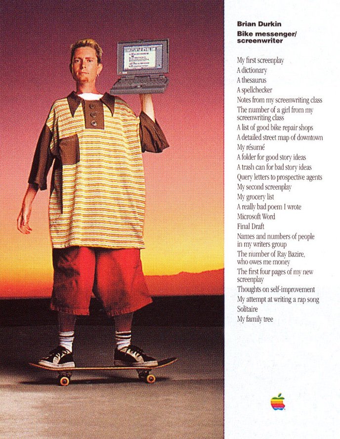
No, the nineties was where it was at. Don’t take my word for it – ask Brian Durkin:

JUST LOOK AT THE BUTTONS

I mean, come on. I’m not even kidding, here – I was never and will never be as cool as Brian. Look at him!

Brian is the study of a man living his best life, here. He’s about twenty, rides a cool skateboard, has great shoes, looks like he was either shrunk down overnight or all his clothes magically expanded, and is holding what I’m assuming (because it’s 1996) is a PowerBook 150 – the last of the classic 68k PowerBooks. The reason he’s doing all that is because he’s part of Apple’s “What’s on your Powerbook” print advertising campaign, which featured movers and shakers and cool people (like Brian) holding up their computers and listing off all the cool, mover-and-shakery things that they were doing with those computers. There were fashion correspondents, movie executives, business people, Todd Rundgren (in an amazing banana-yellow power suit), all showcasing the amazing things that people you might admire or aspire to be (again, like Brian) were doing with their PowerBooks. We like to assume that Apple set the high bar with it’s famous “1984” commercial and then capped that off with the “Think Different” and “I’m a Mac” adverts, but I think that this campaign was brilliant.

Sadly, the “PowerBook” moniker is gone and replaced with the somewhat saccharine “MacBook” appellation, but the question still crops up in a far less interesting and far more frustrating permutation in that it involves people fretting over data and not looking cool on a skateboard. You see, instead of publishing a bunch of adverts in a bunch of probably-now-defunct periodicals, Apple has helpfully rolled that into a convenient and only slightly frustrating graphic built-in to the operating system, thus:

Whither “The number of a girl from my screenwriting class”?

It would be fun if you could actually see a list of the specific items you have on your computer, but on the other hand the PowerBook 150 topped off at about a hundred and twenty megabytes of storage, compared with my MacBook Air’s two terabytes (which is, for those of you who don’t want to go and find the calculator app, about 1.65 million times more space). The list would be… well, let’s just agree it would be a considerably longer list, and not nearly as punchy.

Still, it’s handy to have a top-level idea of how much stuff of what kind is on your computer and have that stuff broken down into common-sense categories. I have (Yellow) an enormous Photo library and (Blue) an equally huge amount of media files on mine, as well as smaller swathes of what rapidly becomes less and less specific as the bands of colors progress. Magenta is “Music” which, okay, is fair enough, and then Red is “Apps” which also makes sense, but then Green is the moderately mysterious “Documents” and Purple is “Mail and Others” which tells me that whoever was in charge of putting those categories may have been going through some things (probably because of the whole 2022 thing) and just lost interest in going further down this particular rabbit hole.

Finally, right at the end there, we have “System Data”, which is what this has all been leading up to; grey-hued and monolithic, enigmatic, remarkably unhelpful and a frequent cause of head-scratching and questions; chiefly questions like “What the hell is “System Data” and why do I have so much of it?” or “How can I free up some space and get rid of “System Data“?

System Data is, well, it’s everything else on your computer that Apple doesn’t have a convenient label for in that bar graph. Typically it’s a collection of options from this menu of data:

• macOS system/browser/user caches

• Disk images (.img, .iso, .zip, .dmg)

• installer packages

• macOS temporary (or log) files

• iOS device backups

Prior to macOS Monterey all of this was labeled as “Other” instead of “System Data”, which is even less helpful and resulted in even more head-scratching. I mean, yeah, “System Data” is pretty vague, but “Other” just seems like the person responsible not only lost interest in their work but also knocked off early to go down the pub – which highly-focussed career-minded go-getters like me and (presumably) Brian Durkin find simultaneously understandable and deeply disappointing.

Fortunately there’s an easy way to manage the data on your Mac without rolling up your sleeves, blocking out your afternoon, and then sitting down to rifle through every folder on the thing searching for cruft and sifting through digital debris. Simple hit the “Manage” button next to the bar graph, and you’ll see the Storage Management window of the System Information app, thus:

I tend to encourage people to ignore the initial recommendations. “Store in iCloud” turns on iCloud Drive and pushes your Desktop and Documents to the cloud, which… well, I admittedly don’t see a lot of computers because people are thrilled how happy they are and want to show off, but this option seems to the root of a lot more heartache than it’s worth for most people. I avoid “Optimize Storage” – removing TV shows and movies I’ve already watched annoys me because maybe I want to put Gigli on loop while I write so I can laugh at Ben Affleck and make cruel comments about his acting. “Empty Trash Automatically” is fine, but then again I also know a lot of people who tend to put things in the trash can as a sort of temporary filing purgatory, and who are justifiably upset when the trash empties itself. Finally, “Reduce Clutter” just does the equivalent of clicking on the “Documents” item in the left column of that window, which is rather redundant.

Whoever took over after the person who lost interest in categories a couple of paragraph ago did a pretty good job with the list on the left of that window. Each option brings up the appropriate list of data and allows you to selectively sort that data by size, kind and data accessed – and then allows you to delete that data without digging around in your computer to actually find the wretched files. The exception is Mail, which tells you how much Mail you have on your computer (even though that figure is listed in the column on the left):

Thanks?

…and Photos, which tells you how much space you’re using for Photos on your computer (even though that figure is also listed in the column on the left), but which also gives you a big, tempting button to click that will remove full-quality photos on your Mac and replace them with smaller “optimized” versions, which will save you a lot of space but removes full-quality photos on your Mac without making it explicitly clear that this is what it is doing to your data:

This might be fine. Or it might be bad! Don’t click the button without thinking about it.

So, in summary, where does that leave us? Well, as I’m the one throwing around rhetorical questions I suppose I’m the one who has to answer them, so here goes:

• Oversized brown-on-orange shirts are a fierce choice,

• Being aware of the built-in tools for data management in macOS gives you a solid understanding of methods for effectively managing and securing your data,

• Recognizing the limits of those tools is equally important, as ultimately your data is something you have sole responsibility for, and you should get to choose what should and should not happen to that data. It’s all about what’s on your Powerbook, after all.

Spelunking into a Chamber of Horrors

Spoiler: there’s no actual subterranean exploration or cavern filled with toothsome denizens of the deep in this one. “Extracting file types and appending them to file names” would, admittedly, be a more accurate description, but not nearly as much fun.

About a week ago a very nice lady handed me a very large folder full of data. I cannot – for a variety of reasons – divulge the identity of the lady (or the source, type and dispensation of the data), but you should rest assured that the lady was nice, and the folder was… large. I’m not betraying any confidences or violating any laws when I tell you that the folder contained four thousand and ninety-six subdirectories, and that the entire sum of the files came to a hair shy of fifty-thousand files which in turn added up to many gigabytes. Almost all of the gigabytes, actually.

Now, that’s a lot of files, but in the grand scheme of things not what you’d call a remarkable; no, what was remarkable was that they were files referenced as attachments from a large, hopelessly damaged and now-defunct MySQL database, and that they had names like:

2b82e7672d8cfb84d47fdcad0cdab4a66a27b247a689e429cc67d83499976c88

And that’s it. No suffix, no identifying file information at all. What, you might ask yourself, is that thing? Is it a PDF? A Word Doc? A GIF of a dog playing a piano? Well, I’d tell you while interrupting your internal monologue, there’s no way of knowing because that file lacks something useful like “.pdf” on the end of the thing. If you tried to open that file then your computer would cough discreetly and put up a helpful message to ask you what the hell you were doing, and would you please stop?

Fortunately, macOS contains within it a panoply of tools both common and obscure that can be used to root around inside these kinds of files, and with a little elementary scripting it’s not terribly difficult to put together a shell script that will make this whole process simple and transparent. Behold then, The Thing That I Wrote:

Enjoy the magenta, blue, green and silver content that I had no decision in but that I’m dubbing “accidentally festive.”

A word of explanation might not go amiss.

First, I needed a place to pull the files from and a place to put them when they were finished processing. I called these places “Attachments” and “Attachments-converted” respectively. Let’s put a pin in that for a couple of paragraphs, as there’s more to explore with that.

Secondly, I used a for loop to go through each item in the folder, and set suffixName as a variable that would pull the file type from the document. I used file -b to query the file type (the -b flag trims the file name and path from the front of the result) which returned something like this: PDF document, version 1.3, 1 pages.

So? Great! It’s a PDF, and – just like this example – every file returns something similar (i.e., the file type in all-caps followed by version information and size). The next move was to pipe that over to grep -Eo '[A-Z]+' which went into that result and pulled out anything that matched all-caps strings, and then sent that over to head -1 which trimmed everything except the first match from that string. The net effect of that series of operations was that as far as the script was concerned “PDF document, version 1.3, 1 pages” had been whittled down to just plain old “PDF“.

I could have let that be, but giant all-caps file suffixes are ugly and seem like they’re shouting all the time, so I piped that over to the translate (tr) command which turned the upper-case text into lower-case and thus turned PDF into pdf.

Finally, I used the mv command to move each file into the “Attachments-converted” directory, renaming it as the original filename (“$f“) followed by a period and the suffixName variable, which turned:

2b82e7672d8cfb84d47fdcad0cdab4a66a27b247a689e429cc67d83499976c88

into:

2b82e7672d8cfb84d47fdcad0cdab4a66a27b247a689e429cc67d83499976c88.pdf

This is probably the point to pull the pin out of the bit I mentioned earlier – notably, how to extract fifty thousand files from four thousand and ninety-six directories. There is, a wiser and more knowledgeable friend of mine, informs me, a very easy and simple way of doing all of this with Ruby, but I’m terrible at Ruby and his solution – while elegant – was far beyond my miserable skill set.

Note: If you do not have a genius-level programming savant as a close personal friend then I strongly recommend you remedy that error as soon as possible. They’re essential tools, and all you have to do is put gin in one end and wait around for complex solutions to appear.

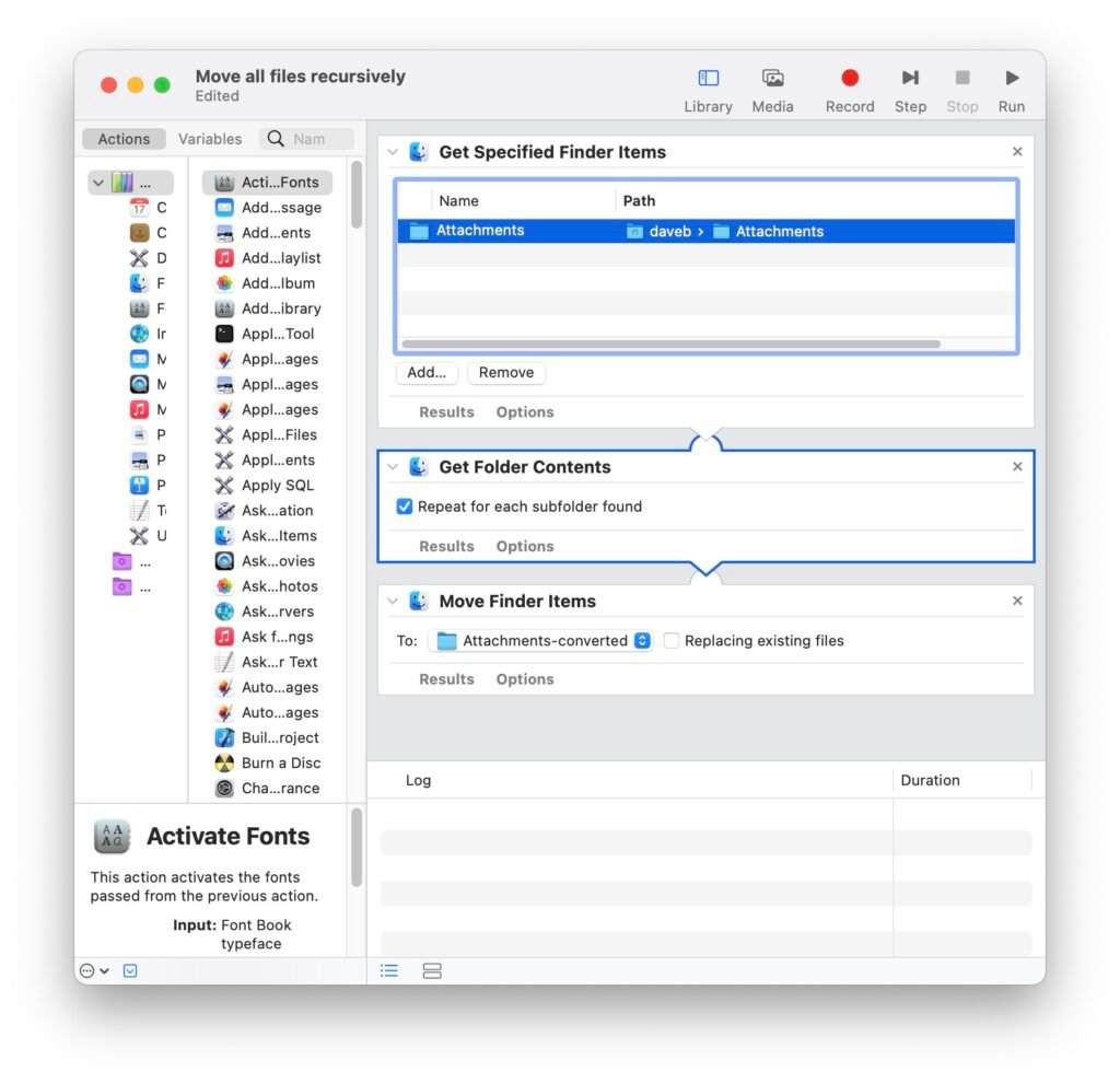
So, I may know next to nothing about Ruby, but I do know a fair deal about Shortcuts and Automator, and Automator excels at this kind of arbitrary donkey work, thus:

The speed at which this entire operation was conducted was borderline remarkable. Automator sorted and moved each file in around ten seconds, and the shell script I threw together had everything examined, renamed and sorted inside about thirty more seconds. The most difficult part of the procedure was trying to work out how to stick it all together – which chiefly involved me staring out of the window with my customary vacant expression – but it’s pretty impressive how the tools that are built in to macOS can be fit together to accomplish some complex solutions to otherwise frustrating problems…

Using Shortcuts in macOS Monterey.

Every year or so Apple churns out another operating system upgrade. This has, of late, become an immutable fact of modern life. The world may be on fire and war, famine and pestilence may be actively stalking the land, but as long as Apple releases an operating system with a cutesy name some time in the fall of each year then we can rest easy in the knowledge that order is preserved, and that the Great Wheel Of The Heavens will continue to turn and drag us all along for the ride whether we like it or not.

Actually, if we’re being turn-the-chair-around-and-sit-down-to-rap-with-the-kids real, it’s not really a new operating system as much as it’s an upgrade to the existing operating system. Yes, of late they’ve incrementally increased the number associated with the thing (we’re up to macOS 12 after lingering on macOS X for nigh on a couple of decades), but the fundamentals of the thing remain essentially the same. Windows and menus and conventions like the Dock reliable persist. There’s still a mouse and folders and files and such, and there’s still a menu bar at the top of the screen.

It’s the menu bar that caught my attention this time round. Honestly, macOS 12 is pretty much the same as the old macOSes save that a) there are many, many new bells and whistles that will be widely ignored by the vast bulk of regular users, b) you can click the little “I’ve-replied-to-this-message” arrow in the built-in Mail app and it will open the relevant sent missive (finally), and c) you can now get a new menu item that you can fill full of your own little bits of code that you can write yourself without much trouble, and actually do something useful with your computer for a change.

This made me happy because I like to do a lot of useful little things with my computer and I do not have a lot of patience with trying to remember how to write code (because I am rapidly aging and don’t sleep enough or drink enough water.) When the shell of your mortal trappings is degrading by the moment you can’t be bothered to write a lot of shell scripts and so forth. A lot of new things get introduced, linger a year or two, and then disappear forever, and the risk/reward of getting intimate with things that are probably doomed tends to make me cynical.

However, this new thing is actually sort of brilliant. Apple took a long, hard look at scripting on their platforms a few years back – effectively sunsetting AppleScript and rolling a lot of that functionality into Automator on the Mac, and cooking up Shortcuts on iOS with a lot of the same DNA. iOS Shortcuts were easy to write and allowed you to do an astonishing amount of useful stuff, and now with the advent of macOS Monterey/macOS 12/what have you, they’ve brought Shortcuts to the Mac and allowed it to run shell scripts. Trust me – this is good news.

I like to block out time every week to work on my stuff. It’s an old habit, and I think it’s a good one; make sure that the software tools I use all day are patched and up-to-date, look at log files and test backups, spend a little time doing the same list of checks and maintenance that I’d do on a client machine. A bad workman blames his tools, and I like not having that excuse available. One of the things that I do as part of that is to update homebrew, and then back up my brewfile and my zsh .zprofile. These aren’t exactly the most intimidating chores, but I’ve often thought it would be nice to have a simple, one-click way to do this that wouldn’t involve manually executing a bash script or relying on launchd or cron to do it for me. Shortcuts for the Mac turned out to make this a terribly, terribly simple operation.

First, I needed a script to update homebrew, then go dump my brewfile to a location where it could be backed up before then copying my .zprofile to that remote location too. Said remote location is my Dropbox folder – I loathe the Dropbox app with a fiery hatred, and instead use Maestral to access Dropbox. Maestral is an open-source alternative Dropbox client that does all the things that Dropbox used to do (i.e., synchronizes your files between computers) and none of the stuff that Dropbox currently does (tries to be Google Workspace, Google Photos, some kind of terrible backup solution, treats you with a profound lack of respect, generally takes over your computer and eats all your memory and CPU). I have a Maestral folder in my home directory, which is then synchronized via Dropbox’s back end.

My work machine is a 2021 M1 MacBook Air (“Razorback” because I like The Expanse and the idea that my laptop is tiny and fast), and the behemoth I currently have toiling away in my office is a 2009 Mac Pro running Monterey via the miracle of OpenCore and SurPlus (“Rocinante”, because I like The Expanse and trend sentimental about aging machinery that can still throw down with the best of them when required). When you create a Shortcuts app on macOS and you’re signed into multiple machines with the same iCloud account then your Shortcuts get pushed to each machine – which is great, unless you want to push a file to Maestral from each machine, as then the brewfile you send from your MacBook Air will cheerfully overwrite the brewfile you’ve already pushed up from your Mac Pro. To get around this I mined ioreg to pull out the hardware serial number from each machine, then used hostname to grab the hostname of each machine, and finally rolled those two variables into the script so that each file that gets pushed up is labeled with the serial number and hostname of the machine that generated the file, thus:

#!/bin/zsh

# First, let's run a brew upgrade because that's just a good idea

brew upgrade

# Next, create a variable called SerialNumber that will pull the hardware serial number from ioreg

SerialNumber=$(ioreg -c "IOPlatformExpertDevice" | awk -F '"' '/IOPlatformSerialNumber/ {print $4}') ;

# ...and a variable called hName so we can grab the hostname of the machine

hName=$(hostname);

# Next we run brew bundle dump to push a brewfile to the Maestral folder

brew bundle dump --file=~/Maestral/"$SerialNumber"_"$hName"_brewfile;

# And then we'll do the same for the ZSH profile

cp ~/.zprofile ~/Maestral/"$SerialNumber"_"$hName"_zprofile

Next, open up Shortcuts (assuming you’re running macOS Monterey), which can be found in the Applications folder and which looks like this:

It’s like a giant letter “S” made out of icons. I mean, fair enough, that’s pretty clever.

Open it, select “New Shortcut” from the “File” menu, then type “shell script” into the search bar and click on “Run Shell Script” from the list that auto-populates below, like so:

You can type your own shell script in there, or just copy/paste my homework in if you’d like. It’s okay. I won’t tell the teacher. Next, go to the “File” menu and choose “Preferences”, then make sure that you have “iCloud Sync” and “Allow Running Scripts” enabled (if, that is, you want to have the thing synchronize via iCloud and also, well, work.)

You might also want to tap the icon for the script at the top of the window and choose a different emoji, and to give it a pithy name. Mine’s called “Upgrade Homebrew”, because I lack imagination. Go wild, though.

Finally, close the window for your newly minted Shortcut, and you’ll find yourself back at the default “All Shortcuts” browser window. Locate your shortcut and drag it to the “Menu Bar” icon, thus:

Finally, you should be able to activate your new Shortcut by choosing it from the Shortcuts menu item that now appears on the right hand side of your macOS menu bar:

…and that’s about it.

Upgrading homebrew can – depending on how frequently you do it – take a while, and there’s no feedback from the Shortcut to let you know if it runs into an error (so it’s good to test your script out using something like CodeRunner before implementing it). The proof, however is in the pudding. And by that I mean the proof is in my Dropbox folder:

Voila!

This whole exercise is just a bauble – Shortcuts is an extraordinarily powerful and incredibly flexible ecosystem for generating what promises to be a pretty amazing spectrum of solid utility applications. I think people are going to come up with some remarkable uses for it, and I can’t wait to see what they cook up…

Why Facebook disappeared today (or: A Concise Primer On How The Internet Works.)

This, I’m sad to say, will hopefully be a short article. I mean, I love sitting down and banging on the keyboard endlessly like an angry chimp having at a mysterious obelisk with the nearest excess jawbone, but this particular ditty is better in short, readily-digestible bites because the subject matter is moderately-to-severely arcane.

Back in 2018 I wrote this blog post for my former employer that I look back on with satisfaction and not the faintest hint of regret. Facebook is an awful company peddling a dreadful product that – while it brings flashes of genuine value to the table – mostly succeeds at demeaning and belittling all manner of social discourse and generally should go and die in a trash fire. I understand that there are differing opinions on this issue, and while I respect anyone who says otherwise they are nonetheless no longer my friend and no longer invited to my birthday party or allowed to enjoy the many entertainments afforded sensible and rational people. You get no clowns, no cake, and we’re not speaking, because you’re wrong and you’re bad, and so is Facebook.

Let’s be clear on this – when Facebook went down today, my only regret was that after a few hours it reappeared on the internet instead of quietly disappearing forever and leaving the world an ultimately happier and safer place.

So, yeah, I’m not what you’d call a fan.

Still, it can’t be denied that Facebook is a Brobdingnagian behemoth of the internet, and Brobdingnagian behemoths are not noted for their proclivity to mysteriously disappear and reappear on a whim. It takes a particular chain of events for that sort of thing to happen, and stepping through those is an illustrative and instructive process for anyone who’s interested in how the internet actually works.

Note: What follows is tremendously simplified. Yes, I understand that DNS is not a series of tubes or what have you. Don’t write me.

There are three mechanisms/sets of acronyms at play here – DNS, BGP and AS.

DNS (Domain Name System) is sort of like the telephone operator of the internet – a helpful service that turns who you want to talk to into a number that can be looked up and connected to. When you connect your computer to the internet, chances are that your ISP will – in addition to giving you an IP address – also ensure that you’re connected to their DNS server, so that when you want to go to www.facebook.com then your computer will go and send that request to that DNS server. Your ISP’s DNS server will then look at the request (i.e., “www.facebook.com”), and if it has the IP address of the destination you’re trying to get to cached then it will tell your computer what that IP address is and where to find it.

If your ISP’s DNS server doesn’t have that address cached, then it will send your inquiry on to a higher-level of DNS server that handles anything that ends with “.com”. That, in turn, will look up the address for “facebook.com” and send an inquiry to the DNS server that handles “facebook.com”, which will in turn look up “www” and finally, return the required address for “www.facebook.com” to your computer. This process takes milliseconds, and is largely invisible to you – the end user. You are then free to go and peruse anti-vaccination memes and worry about what your parents are doing on the internet. This last part occurs through the miracle of complicated internet magic.

BGP (Border Gateway Protocol) is… well, it’s the aforementioned complicated internet magic. Simply put, it’s the system responsible for mapping all the paths between the networks that comprise The Internet. Let’s not forget that we tend to talk about The Internet as a monolithic thing, whereas in fact it’s just an enormous (and I mean really enormous) collection of discreet networks all sort of bolted together in an ad-hoc and largely disorganized and chaotic fashion. BGP is used by each of these networks so that they can talk to each other in the most efficient way possible. When the aforementioned complicated ballet of DNS lookups has taken place then your ISP’s routing system consults its BGP table and figures out the shortest and fastest way of getting you to your final destination.

Another Note: There are actually two flavors of BGP that handle both internal traffic inside a network and external traffic between networks. We’re just worrying about the latter right now, because – spoiler alert – that’s what knocked Facebook down.

AS (Autonomous Systems) represent large entities or blocks of networks on the internet. Technically, they’re formalized collections of routing information, but that’s a whole other rabbit hole best avoided for now. Think of them as sort of like special addresses for large networks on the internet. State organizations. Governments. Large utilities. DNS providers, web hosting services, and big companies like, say, Facebook. Each of those entities is assigned an AS number, and at present there are about 100-150k in active use out of an available pool of about 4.2 billion. Each AS advertises its presence so that BGP tables can incorporate that information into a routing table and therefore figure out the quickest way between one place and another.

So; Facebook has an AS number that’s used by BGP so that BGP knows where to route data (including DNS data) to get to Facebook’s many fine products. It’s become increasingly clear that what may have happened is this: in the course of routine maintenance of Facebook’s BGP configuration something happened that locked out access to remote users who might be able to fix the problem. As a result, traffic on the internet was no longer able to be routed to Facebook – including DNS traffic – with the end result being that Facebook’s entire AS simply… disappeared from the world.

As of my writing this, everything seems to be back to normal. At least, inasmuch as Facebook being a functioning entity approximates normality.

Less is More (or less)

Here’s the thing: I had another post all prepped and ready to go, but instead of prattling on about Digital Legacy (which, to be fair, is a genuinely fascinating idea if you’ve ever wondered what happens to all your Digital bits after you die – albeit somewhat gloomy), I thought it would be more fun to do what I arguably do best; break out my soapbox and start yelling incoherently and impotently at the brooding and uncaring skies about UI design.

Look, okay. I’m not hurting anyone. It’s cheaper than day-drinking and everyone needs a hobby. Leave me alone.

I’d like to kick off with a quote from my old boss (or boss’s boss – the org chart at the time was confusingly egalitarian) Ray Ueno. Back in the early 2000’s we worked at a fabulous company that did remarkable bespoke boutique Branding and Identity work, and at some point said company was acquired by a succession of larger fish in short order. It’s hard to really explain what “bespoke, boutique Branding and Identity” work actually involves, and so as an attempt to clear a few things up we produced an internal video piece – part documentary but mostly skit – to showcase our company culture to our New Corporate Masters™.

Ray’s segment featured him – ensconced in his corner office, bespectacled, focussed, wryly soft-spoken – sorting through his mail and mostly just throwing it all into the recycling bin – unopened – while he ruefully confessed to camera.

“It’s interesting, because a friend of mine came to visit me once and she told me after seeing my office – my little cubby space – she told me that some of the greatest thinking minds in the history of man actually were slobs in the office. Guys like Einstein and Da Vinci and Aristotle? I guess they were slobs just like I was, and I thought “Well, I guess I can make that work for myself. I like that a lot.” 

And then I got this big promotion and I got this office. And my office has been clean ever since. 

Not quite sure what to make of that.”

The piece was, of course, a joke. One of the designers was portrayed as a borderline obsessive, concerned solely with oral hygiene. The CEO talked about her family’s rich history in dentistry and her resultant aversion to blood. And, honestly, I don’t recall whether Ray’s office was actually really that tidy, but I don’t recall it being a noted disaster area either, so the truth of the matter is that it probably stood betwixt those poles and showcased the normal amount of clutter.

Still, the meat of the business is worth exploring; to whit, that cleanliness and orderliness are synonymous with progress, whereas messy, messy desks are problematic because for every Einstein there are a million, billion people who Just Never Clean Anything Up Dammit.

Happily, the metaphor is sustained when it comes to talking about operating systems, as provided you’re talking about a non-mobile platform you’re pretty much universally buying into the idea that the place on the screen where you keep most of your icons is your Desktop, that the directories you store your data in are colloquially known as Folders, and even that the data itself is mostly described as Files. That’s the problem, though – when erstwhile, predominantly-mustachioed, bell-bottom-clad 1980’s software engineers were pioneering the concept of the GUI they naturally seized onto what they had at hand – desks and work surfaces – and made Digital analogs for those things. It turned out to be an effective and genuinely useful idea; that you could take the idea of a conventional, physical experience and translate it into a digital form, and with that they brought along a lot of assumptions from the one experience and lumped them into the other. It was a move of staggering simplicity and rare genius, and paved the way for how we’ve interacted with computers for the last forty-odd years. It was a turning point; rare and perfect and brilliant.

And, it turns out, when you stretch it to the limit it starts to become irredeemably problematic.

Note: I’m going to harp on about UX and UI for a while, so it’s probably worth setting out a very basic idea of what I’m talking about when I start blathering on about that. Another note: I am not a UX/UI designer – or any kind of designer for that matter – but I’ve butted up against that world just enough to have a working idea of the most basic concepts. UX design is – in a nutshell – the design of the User experience. If you’re, say, designing a bank’s website then you’d turn to a UX designer and have them come up with ideas about how to make the thing functionally simple, easy, and intuitive for your end users. With that in hand, you’d need a UI designer, as UI design concerns itself with the interactivity/look and feel of the design. It’s unfortunate that UI design is often broadly interpreted as “make the buttons look pretty”, but the reality is that it’s a far, far more complicated and nuanced business than that. Right. Notes over!

The problem, I suspect, is the iPhone; once it hove into view then that fundamental rethink of how we interact with devices became a sort of sea change that rolled over into other platforms and fields. Making mobile device interfaces as bone-simple as possible isn’t – in itself – controversial; after all, if you have very limited screen real estate and need to present a core set of functions to end users then you have to make some hard choices about what to put in, what to take out, and where to put everything. To make matters more complicated a lot of users expect mobile applications to offer a sizable portion of the same configurations and options as the equivalent Desktop product, which leads to some significant challenges re: shoehorning solutions designed for enormous screen real estate into a tiny, tiny fraction of said real estate.

So, challenges abounded. And, by and large, UX and UI rather stepped up to the plate, to the extent that thoughtful, resonant design has flourished and the App Stores of your mobile platform of choice are – generally speaking – stacked to the gills with clever, well-designed applications that fulfill the major functions of Desktop or web clients. So. Well done all round. Time to roll out the red carpet to all concerned, award small trophies, and fire up the grill for the celebratory UX/UI Association Pancake Breakfast and Annual Jamboree? Absolutely. Except…

Here’s the thing. It’s one matter to take limited resources (i.e., screen real estate) and pare away the dead wood in the name of functional parity with Desktop applications, but it’s another thing entirely to do the same thing in reverse; i.e., take a look at your fancy mobile platform with its clean layout and simplified controls and then decide that well, if people like not being able to see a lot of buttons on their iOS devices then logically it follows that they don’t want to see a lot of buttons on their Desktop computer. Yes, that was a hell of a run on sentence, but I’m annoyed – no, I’m irate – and I’m all bent out of shape because of this:

I am a geyser of rage.

This, I realize, might require a word of explanation. In a nutshell, this defaults write command allows you to turn this:

Ugh.

into this:

Well… better. I guess?

“Those,” I hear you cry, “are two screenshots of macOS Finder windows that are pretty much the same.” No, no they are not. I mean, yes, okay, technically they’re both screenshots of the same folder, but the first one is set with the default options you get with macOS Big Sur (and so far with macOS Monterey), and the second one is what you see when you tell the Finder to stop being a bloody idiot and actually show you some useful things for a change.

The first screenshot – the default view – shows you arrows for navigating back to the prior screen, the name of the folder, one view menu that you can toggle to reveal other options, another for sorting the contents of the window, share, tag, and options buttons, and a truncated magnifying glass search button. (Both windows also contain a Synology Drive button because I love Synology Drive, but we’ll ignore that for now, okay? Okay.)

The second screenshot has the name of the folder centered at the top of the window along with a permanently-viewed proxy icon, a full set of clickable view options, the same share, tag and options buttons, and a full search field.

These, I hear you say, are not so different. There are few real deal-breakers here. Yes, having the proxy icon visible without having to scroll over it to make it something that you can click on is a definite boon, and sure, being able to quickly click on a view type and also type directly into the search bar are mild improvements and remove small annoyances, but there’s little there to make a fuss over. That’s fair, but the greater point is that we should be asking ourselves “What prompted the move to take those options away by default?” If having a full search field available saves you clicking on the magnifying-glass icon and watching the cute little animation then it also saves you a few fractions of a second of clicking around, stabbing at the little icon. Likewise not having to scroll up and down a menu to choose a different view. These are not monstrous intrusions on your day, but they are paper cuts to the soul for people who like having everything on their desk that they need. Removing them is an unnecessary indulgence in the name of cleanliness.

And, worse yet, they’re entirely redundant. What, after all, is really being saved in hiding those features? Nothing. Nothing is being saved. A Finder window doesn’t have the same stringent limitations on screen real estate that you’d find on a mobile platform. There’s no real-world benefit, here. To duck back into the now-tired metaphor, it’s like keeping your stapler in your desk drawer when you use it all the time and there’s a spot right on your desk where it’s lived for years, not getting in anyone’s way and cheerfully doing nothing except dispensing staples and letting you get on with life.

So, sure, I’m all bent out-of-shape about how my computer looks. Fine; I’ll hold my hand up to that. But stripping my personal tantrum aside, it’s worth putting your head to the proverbial railroad tracks and listening to what’s oncoming. After all; what’s next? How many layers of elephants can you go down before there’s nothing left at all? It’s not as if this was a decision made out of necessity – in fact the procedure to turn the old view back on has been in macOS for years, albeit entirely undocumented.

Let that sink in a moment: Apple – a company synonymous with industry-leading and ground-breaking UX and UI design – made a sea change in the interface that people were used to, stripped away functionality for no discernible reason except in the service of clean design, and could have easily put a button somewhere in the OS that would have allowed you to just toggle it back to the old, more functional view. I am not Apple and not part of their macOS development team, but if you were to tell me that a professional operating system designer could have taken more than five minutes to write that code and slap that button into place then I’d be fabulously, fabulously surprised.

There’s value in good design that informs the user experience, and in the pursuit of that it’s entirely appropriate to decide that Less is More. But there needs to be an ounce of examination of what motivates that design. After all, sometimes Less is just… less.

My new office is slightly warmer than my old office (or: manually adjusting temperature controls on Synology NAS.)

Look, it’s been a while since I wrote one of these. I feel kind of bad about that, but on the other hand it’s been an interesting couple of months of doing more IT than writing about doing IT – which culminated in the entire floor of the building I had my office in being sold to some shadowy conglomerate and thus having to go and find a new place to work from. Tl;dr – I’ve been busy.

Still, I have a new office now, and it while it has… indifferent air conditioning, it also has big, cool, old-fashioned windows that let a lot of sunlight in.

This is the least-cluttered this desk will ever be.

This, of course, is lovely. And I have no complaints about this save for the fact that my Synology NAS gets warm, and because it gets warm it decides to turn itself off semi-regularly, and while I appreciate the clever design of a piece of tech that takes the extra step to preserve data, I’d really rather it didn’t do it quite so often.

The root cause of the problem is that my NAS is full of SSDs, because they’re quiet and fast and I had a lot of SSDs and nowhere to put them. They’re a superb alternative to old-school rotational hard drives, although they do tend to get warmer, and that’s the issue I’ve been running into. Regular hard drives run fairly cool, and the Synology DSM monitors the temperature of those drives and switches itself off once they hit about 61° – which is fine and laudable because having your NAS shut itself down is infinitely preferable to having your NAS suddenly filled with the screaming, smoking ruin of all of your hard drives exploding at once. SSDs, however have a significantly higher thermal threshold before performance and functionality degrade, and so shutting down when an SSD hits 61° is somewhat premature.

Synology DSM gives you some fairly stripped down tools for managing temperatures – chiefly, the ability to choose how fast the fans run in the thing and thus how effectively they can cool the drives down. And when I say “chiefly” I mean “solely”. Still, I started doing some digging into what could be done to manually adjust those fan speeds – after all, Synology NAS units use Linux as an operating system, and as such a lot of settings for how the thing actually runs are stashed away in editable form in .XML documents. Fan control should be, therefore, something that could be tweaked, and shouldn’t be limited to just the handful of presets that Synology gives you to work with right out of the gate. It transpires that fan speed and settings are stashed in a file called scemd.xml that can be accessed by ssh-ing into the DSM, and that when you open that file you see this:

Now, I don’t know about you, but I see fan_speed in there and also disk_temperature, and it didn’t take a herculean leap to note that:

<disk_temperature fan_speed="99%00hz" action="SHUTDOWN">61</disk_temperature>

…might mean that when the temperature of the disk gets to 61° then the NAS decides that it’s time to shutdown. Common sense would dictate that if you could edit that file with a temperature that an SSD might be happier with – say, 70° – then the thing wouldn’t stop working every time there’s a warm day (which there are a lot of here in California). So, I decided to fix it, and here’s how I did it.

First, you’ll need to log in to your Synology DSM and make yourself a home folder on the thing to work from (it’s possible to do all the below a lot faster if you log in as root, but I prefer to go slow and steady and build in break points when I’m tinkering around with the device that holds all of my work data oh god please don’t go wrong). In the DSM, open the Control Panel, hit the Terminal & SNMP tab, then check the box to enable ssh.

Open a terminal window on your Mac, and log in to your NAS via ssh:

ssh administrator@fake-nas-name.local

Note: I’m using administrator and fake-nas-name.local as the user and name of the NAS for the purposes of this article. Use your actual admin name and the address of your actual NAS. That sort of goes without saying, right?

If prompted, hit “yes” and then enter the password of the DSM user you’re ssh-ing with.

DSM users don’t have homes set up by default, but you can make one by doing the following in the ssh session:

cd /var/services

sudo mkdir homes

sudo chmod 777 homes

cd homes

sudo mkdir administrator

sudo chmod 777 administrator

Once you’ve got that set up it’s time to go and start mucking with the scemd.xml file. Because I’m not an utter blithering incompetent I decided to go make a backup of that file so that if I screwed something up terribly, terribly badly then I’d be able to roll things back. I encourage you to do the same:

cd /usr/syno/etc.defaults

sudo cp scemd.xml scemd.xml.bak

With that out of the way, it’s time to go grab the scemd.xml file and either edit it yourself on the DSM or do what I did and copy/paste the thing into BBEdit on your Mac so that you’re not tampering with a live file. To to this I just did a cat scemd.xml and then copy/pasted out from the terminal and into BBEdit.

The scemd.xml file is pretty straightforward; it’s laid out in sections with the settings for the NAS at the top in both DUAL_MODE_HIGH (i.e., the DSM default more-cooling-more-noise) and DUAL_MODE_LOW (quieter fans, more heat) underneath, followed by settings for a lot of expansion chassis units that we’re not going to mess with.

Find the DUAL_MODE_HIGH and DUAL_MODE_LOW lines that read:

<disk_temperature fan_speed="99%00hz" action="SHUTDOWN">61</disk_temperature>

and edit the 61° to 70° so that it reads:

<disk_temperature fan_speed="99%00hz" action="SHUTDOWN">70</disk_temperature>

Save the file to your Desktop, close BBEdit, then open a new Terminal window.

The next step is to move the newly-edited sceml.xml file to your newly minted home folder on the DSM, which you can do with this command:

cat ~/Desktop/scemd.xml | ssh administrator@fake-nas-name.local 'cat -> scemd.xml'

Jump back into the Terminal window running your ssh NAS session and check that the scemd.xml file is in your home folder:

ls /var/services/homes/administrator

All things being equal you should see scemd.xml as the output.

Finally, you’ll need to write over the existing scemd.xml file with your edited version, and then copy the new file to /usr/syno/etc:

sudo mv /var/services/homes/administrator/scemd.xml /usr/syno/etc.defaults/scemd.xml

sudo cp /usr/syno/etc.defaults/scemd.xml /usr/syno/etc/scemd.xml

Reboot your Synology NAS to restart the appropriate services, and that should do the trick.

As is ever the case with these things, your mileage may vary, and any time you tinker with the guts of your NAS you run the risk of fat-fingering something and the whole thing coming crashing down. Please, I implore you, please do a full backup of your data before attempting to do any of the above.

So far, this has worked without incident. In fact, as of writing this I can see that one of my SSDs is hovering at about 57° and the other is running at °61 without a hitch, which I’m calling an absolute win…